First Place(¥100,000)
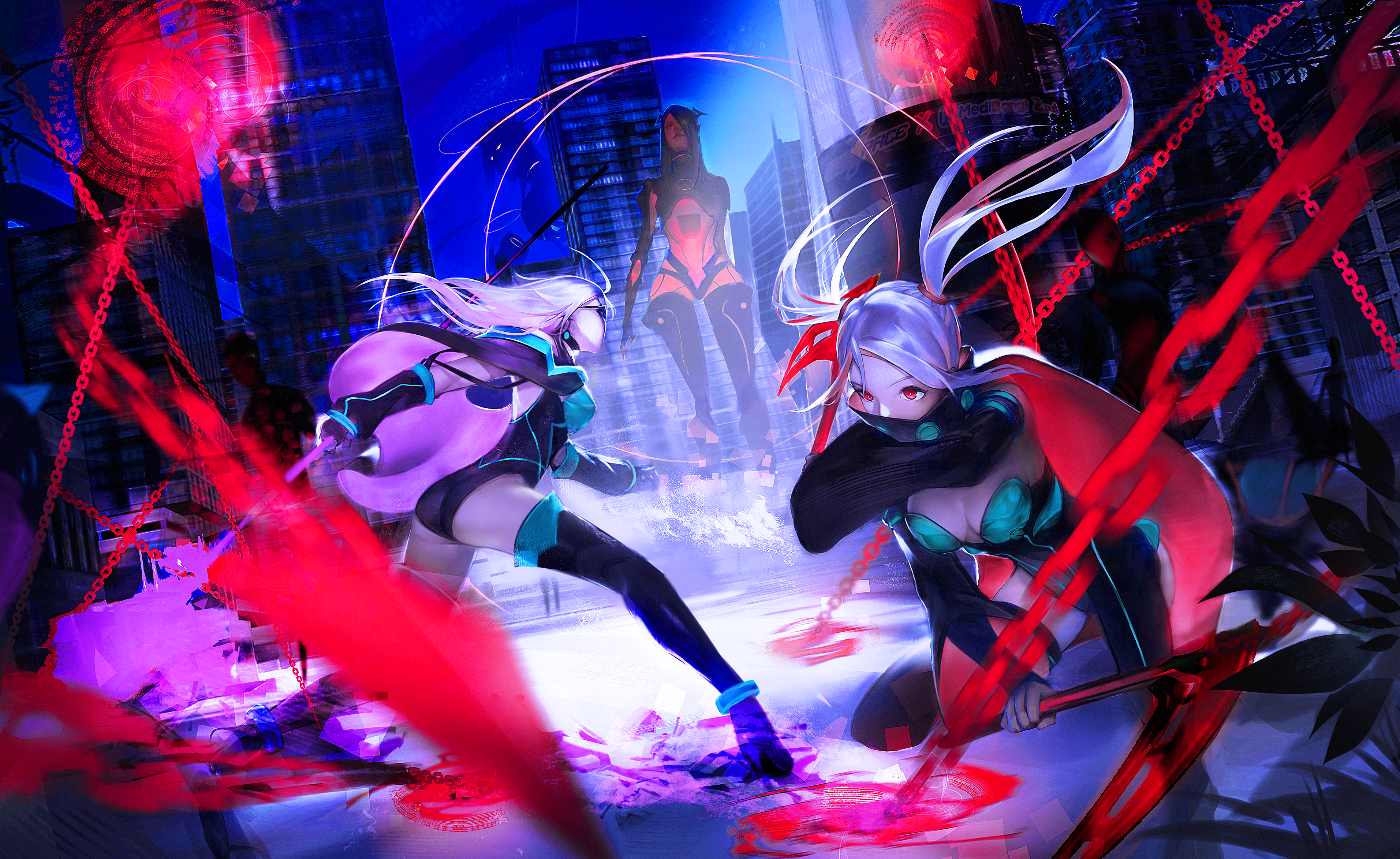
Author Shinosinja
![]() Comment from Shigeki Maeshima
Comment from Shigeki Maeshima
Great Composition, sense of colors using, story telling are all perfect. It makes readers as if there were right in the scene. Furthermore, the portait of characters are pretty attractive. Marvelous!I would like to see more about your illustrations.
![]() Comment from COSPACE
Comment from COSPACE
Characters' action, expressions, and the atmosphere are impressive. The color contrast make these two characters much more outstanding; however, it might be better to use other colors to make them much more distinctive. It is a little pity that sketch lost its shape. Hope this author would make more effort on it. As for the content, colors and composition make this work full of weird and highly aggresive atmosphere. The idea of setting the background in Sya city is pretty novel. The Moneta and Dark Hikariko reveal the tension of the battle, as if storytelling in pictures.
Second Place(¥50,000)
![]() Comment from Shigeki Maeshima
Comment from Shigeki Maeshima
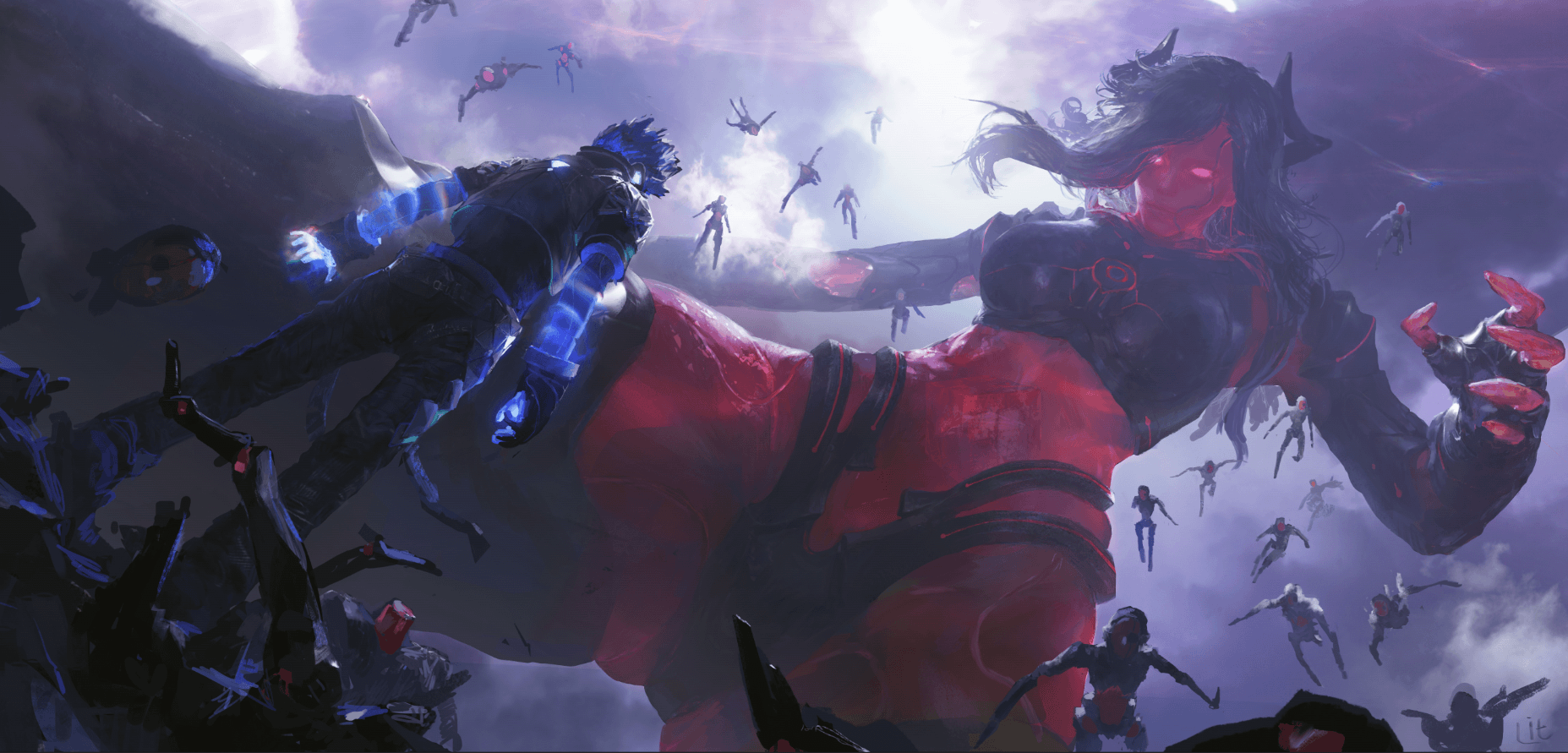
The author has completely created a world of his own, not only a unique worldview, but also excellent performance of light and shadow. What we could do is to pay a visit silently.
![]() Comment from COSPACE
Comment from COSPACE
Shocking scene and foreground are well drawn. Especially the depiction of giant Hikariko make a strong impact on readers. However, it would be more attractive if the design of Dark Hikariko were well designed. As for the content, it looks quite good that Pulse's pose pictured like he were "fighting the battle by himself." At the same time, his ability is also shown in his hands. The picture of Dark Hikariko Origin and Dark Hikariko Shells makes readers as if they were right in the scene. The impact completely corresponds to the theme "The last battle."
![]() Comment from Shigeki Maeshima
Comment from Shigeki Maeshima
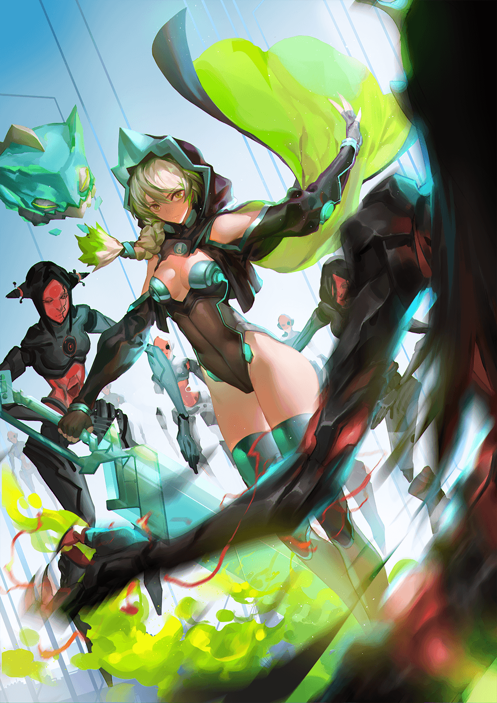
Each of the character has his own charisma that makes the story vividly. Character's battle scene seems to come to my mind. This work is like a frame of a movie.
![]() Comment from COSPACE
Comment from COSPACE
Characters are very well drawn. Especially the texture is well depicted too. However, it would be much better if composition were much more impactive. There are some interesting parts, for example the theme is called "Ambush". Since the background looks similar to a spacecraft, it gives the impression that Azra is ambushed in her own spacecraft.
Third Place(¥20,000)
-
 Comment from Shigeki Maeshima
Female character's beautiful skin catches the reader's eyes. Pop color theme conveyed this author's pleasure of creation to readers.
 Comment from COSPACE
Character's texture is well depicted. But it would be even better if skin color were made much more clear. Besides, it will be better to make the foreground more stereoscopic. For example, it is difficult to understand what on earth the cube is. It might be better if it were a swim ring or a chair. Calming colors looks peaceful and gives it daily life feeling. All in all, the combination of beach and swimsuit is the classic theme of daily life.
-
Author shukei
 Comment from Shigeki Maeshima
Simple and pop colors of characters, clear composition catches the reader's eyes. It makes reader feel like the story is about to begin. It's a great illustration that raises reader's expectations.
 Comment from COSPACE
Characters are well depicted and simple colors make readers feel refreshing. It would be better if these elements were also applied on the car. Besides, it would be better if the structure of the car were drawn in more details. This is a scene about a race is going to start. It makes readers as if they could hear the engines launched. I guess this author had read character's description properly. For example, Ruby's hobby and the friendship between Blavi are well connected throughout different stories.
-
 Comment from Shigeki Maeshima
I was fascinated that heroic characters were drawn all together. This picture shows its power, which brings expectations to readers and also invite readers to a new adventure.
 Comment from COSPACE
Features of every character are well depicted. Especially the middle one. The background is too blurry to make it feel like space. However, illustration of hierarchical makes it feel wide. As for the contents, the debut of all Hikarikos looks pretty cool. Meanwhile, each of the character has the different facial expressions, which makes the picture more lively. Only Pulse is expressionless as always.

From Shigeki Maeshima
Depicting an unique worldview and characters is a hard task. However, it is quite impressive that all the submissions are so brilliant that they all derive from artists' imagination. It is good that every artist has his own thoughts; meanwhile, it is also good that some parts which artists focus on are the same. I wish every artist could take a look at other submissions, which may lead artists to different discovering. Every artist may enrich their contents and broaden the worldview at his limit. I appreciate all the submissions. Thank you all.


