
Painting in low saturation
2020-12-11

I will walk you through the process of painting with a low saturation, thinking about how to choose the colors, especially the shadow.
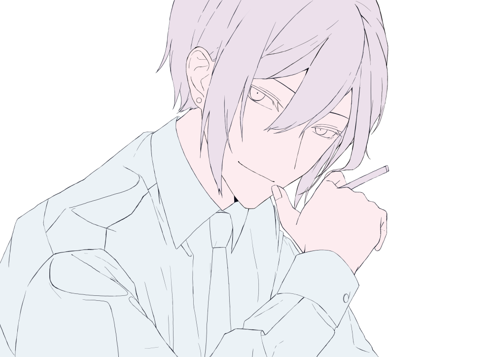
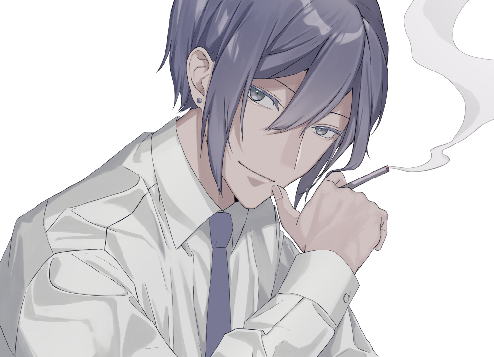
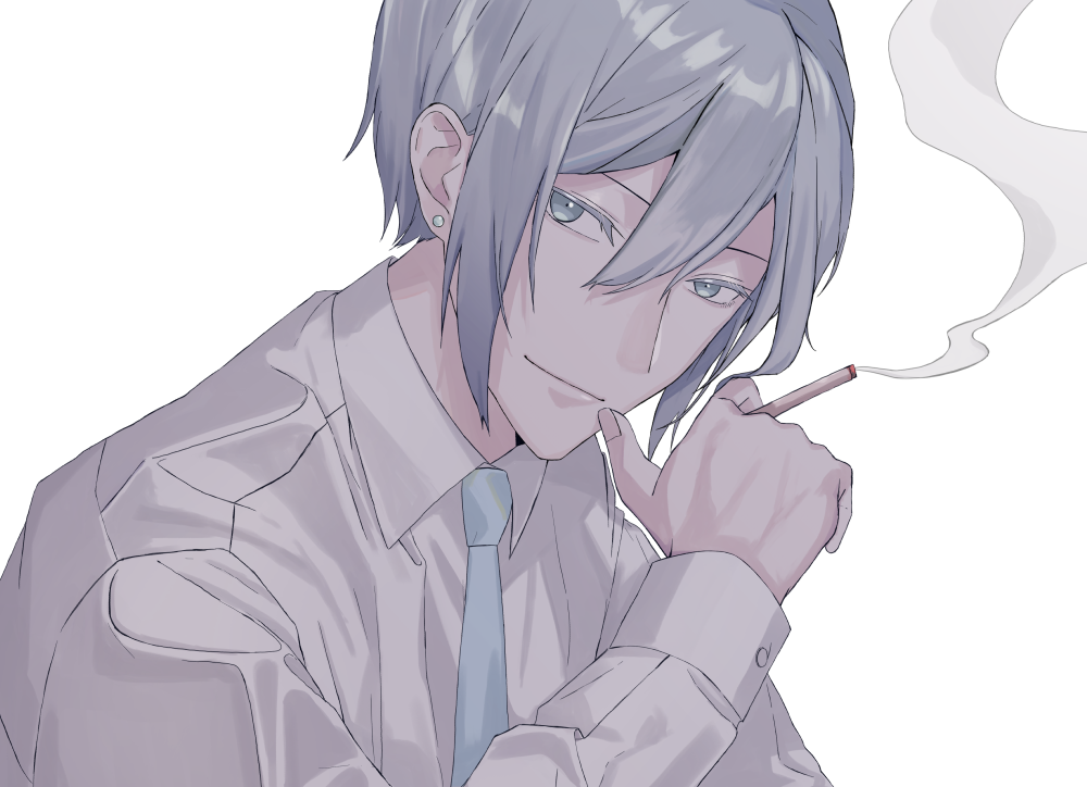
This is the finished artwork.
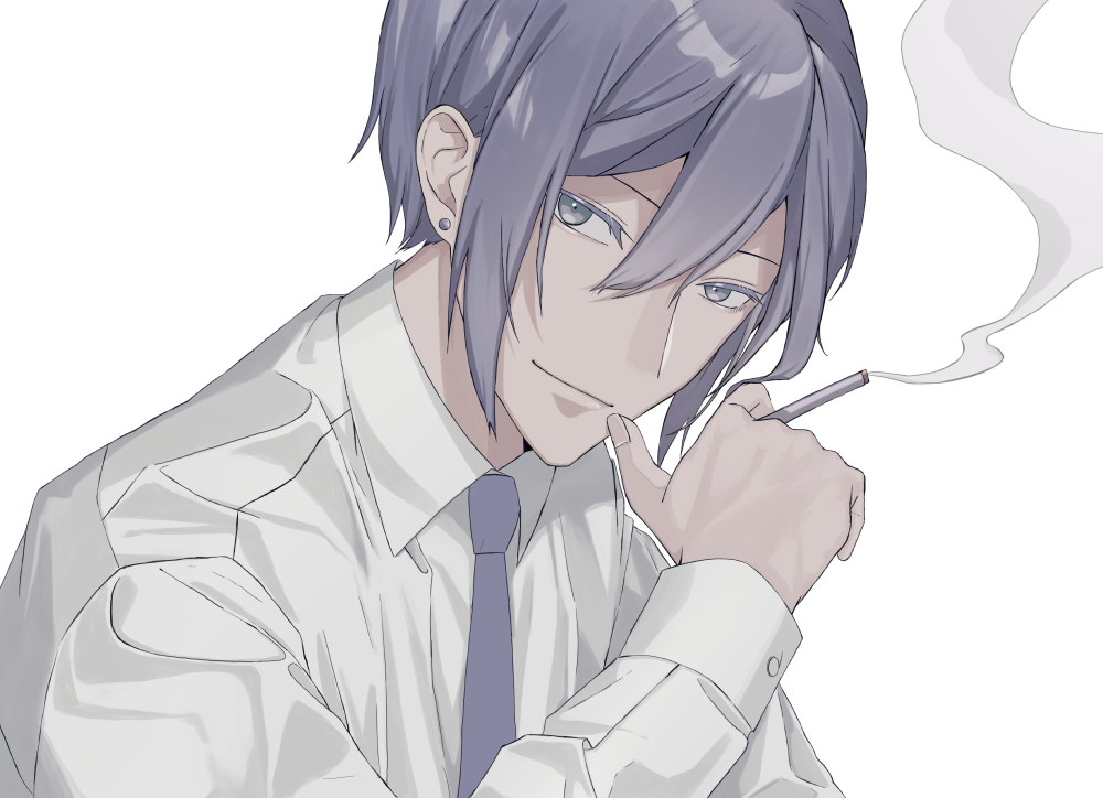
This artwork uses colors with low saturation. It makes the guy seem more intelligent!
First let’s choose the base colors.
Create several color schemes, and decide which one looks good.
I will show you 2 good color schemes, and 1 bad example.
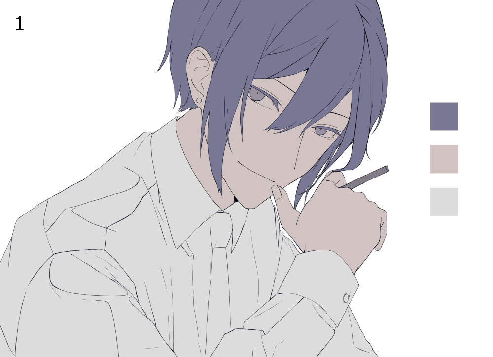
Good examples
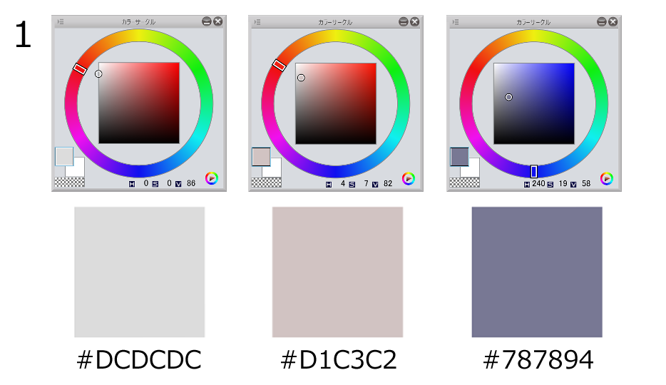
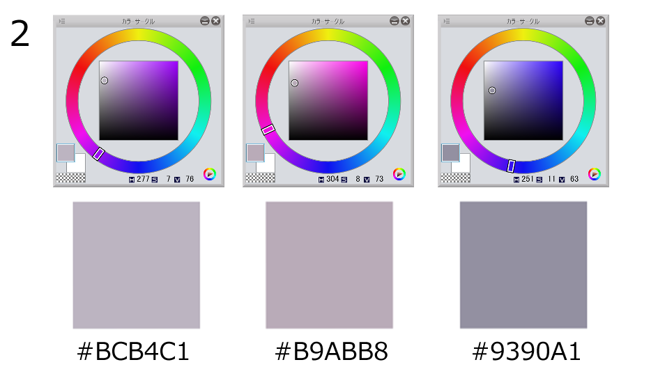
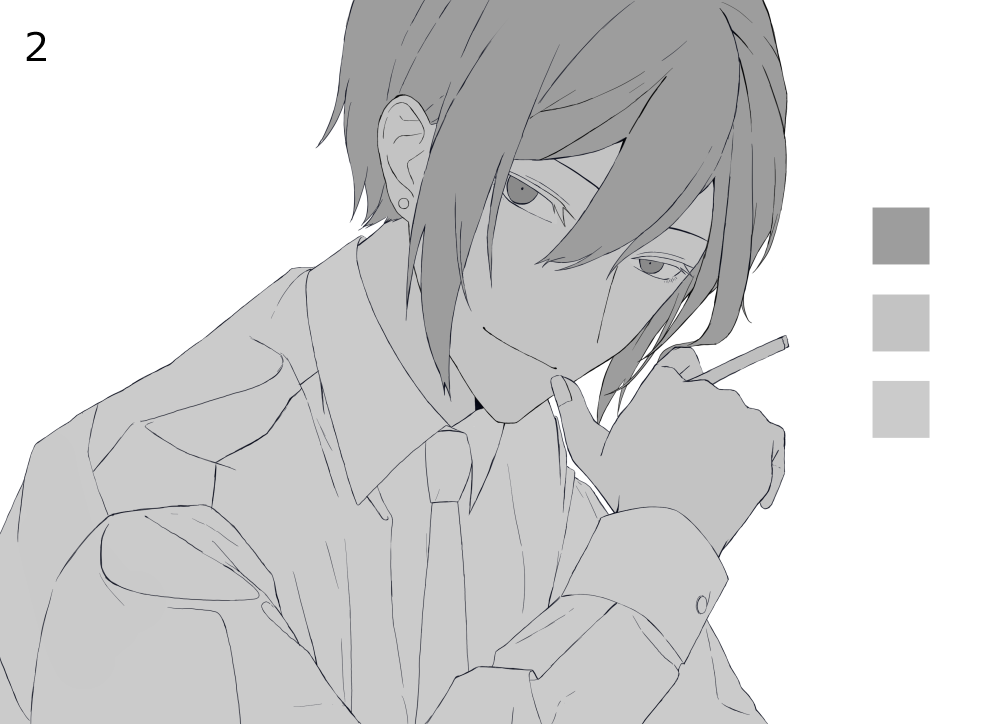
Color scheme 1
Good examples
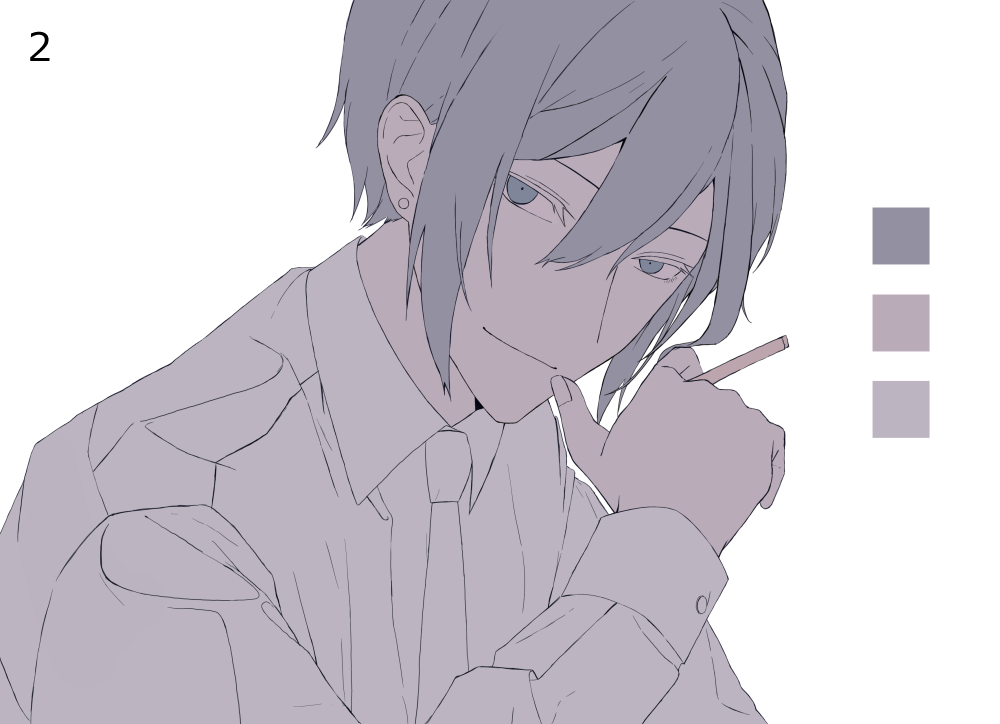
Color scheme 2
Because I want a saturated look, I used colors at the left side of the color circle.
Color scheme 1
Color scheme 2
This doesn’t mean you should use the colors at the very edge.
This is what happens if you overdo that.
Bad color scheme
This is bad because there isn’t much difference between the background and the character.
The hair and the skin have similar colors as well.
You could tell it would look much better with different colors.
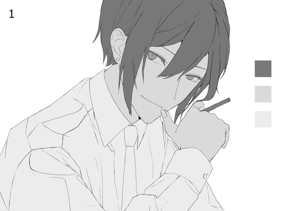
You can especially tell why this color scheme is bad if I made the colors grayscale using a gradation map.
This way you can focus on just the values.
See, it’s almost 1 color.
If the values are like this, the character doesn’t stand out.
The whole artwork just looks white.
If you start with a base color like this, you might struggle with the shadows and highlights too.
So how should you choose the base colors?
I also turned the 2 good examples to a grayscale image.
Good examples
You can see the skin, hair, shirt has different values.
See it in comparison!
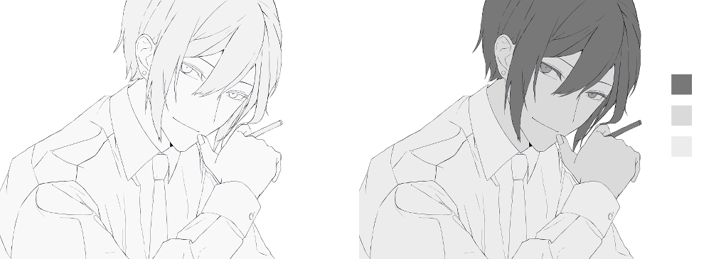
left : Bad examples right : Good examples
If you want to create a saturated look, try not to go overboard with the colors.
Let’s paint the skin.
Use the eyedrop tool to select the base colors.
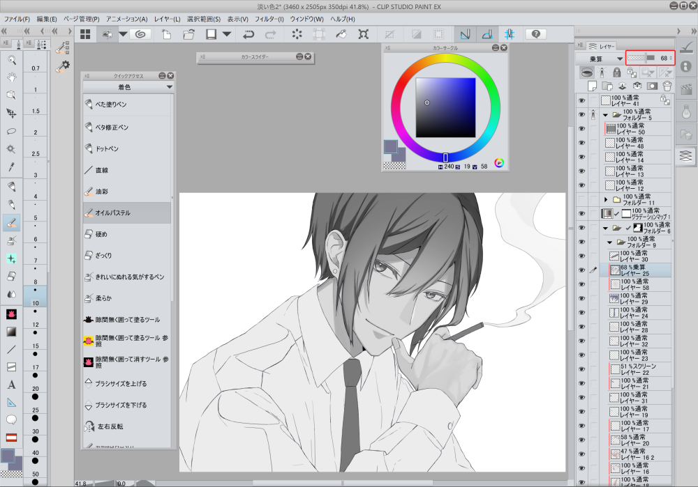
Add a new layer, set the blending to multiply, and check clipping.
Use this layer to add shadows.
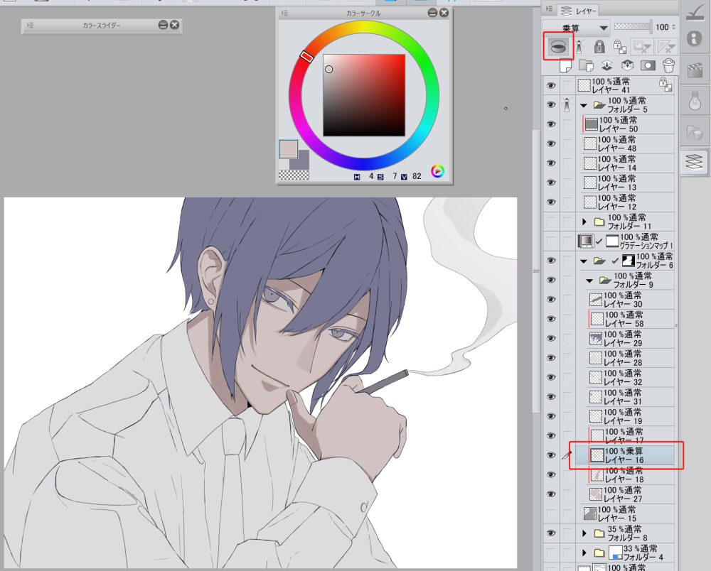
I added the shadows.
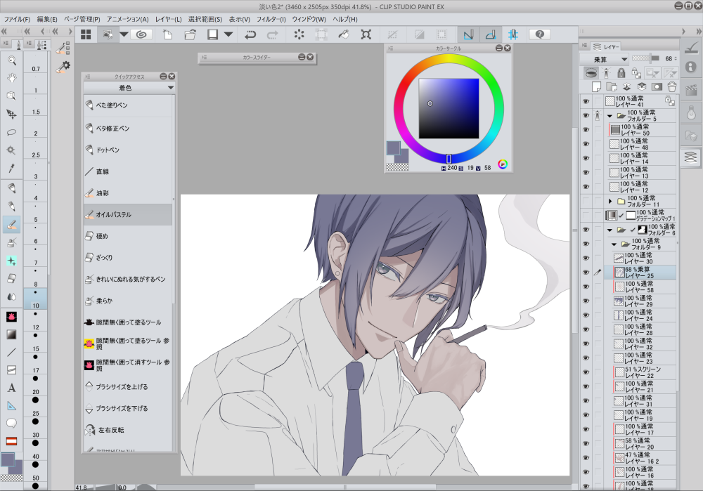
Since the theme is a saturated artwork, I thought the shadows were too strong.
I adjusted the opacity to fix that.
My tip is to use a gradation map for this process.
Add a gradation map layer on top of the color layers.
By switching the gradation map layer visible/invisible, you can check the values.
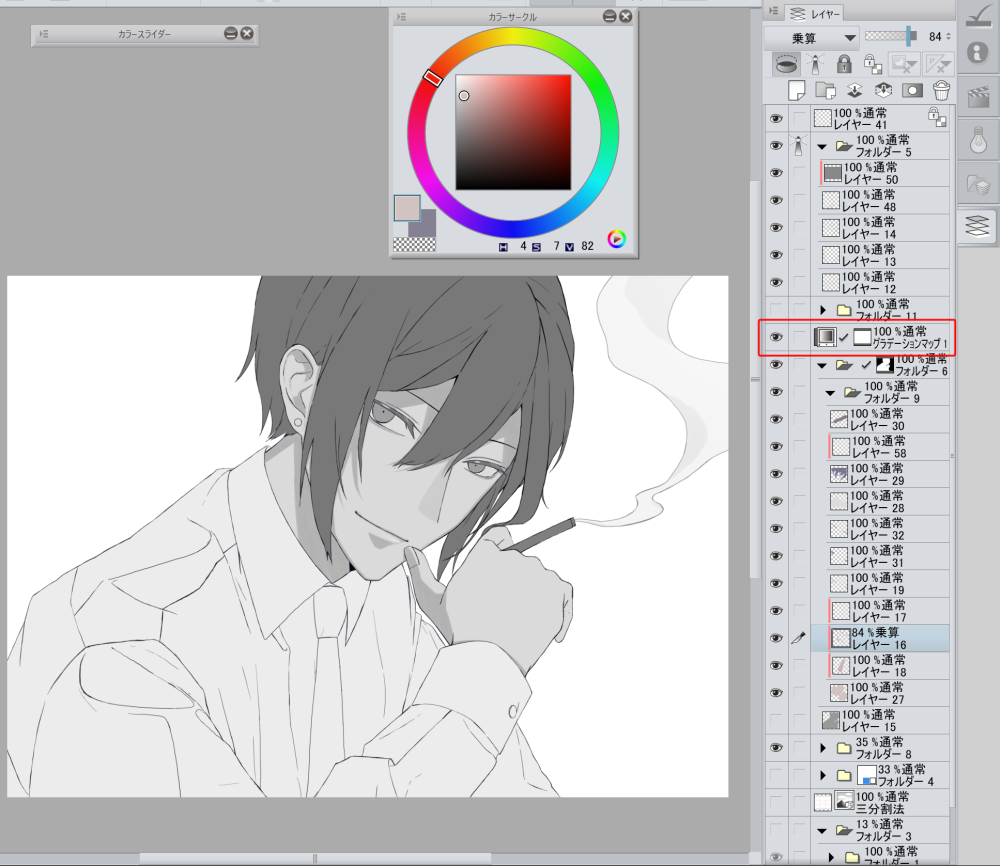
I used a gradation map to grayscale the image, and adjusted the opacity of the shadow layer to 84%.
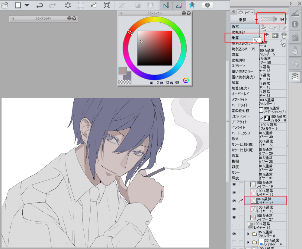
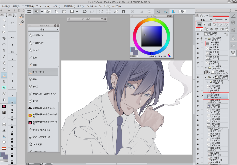
After the values of the shadows are adjusted, I added more shadows.
Here is what I did.
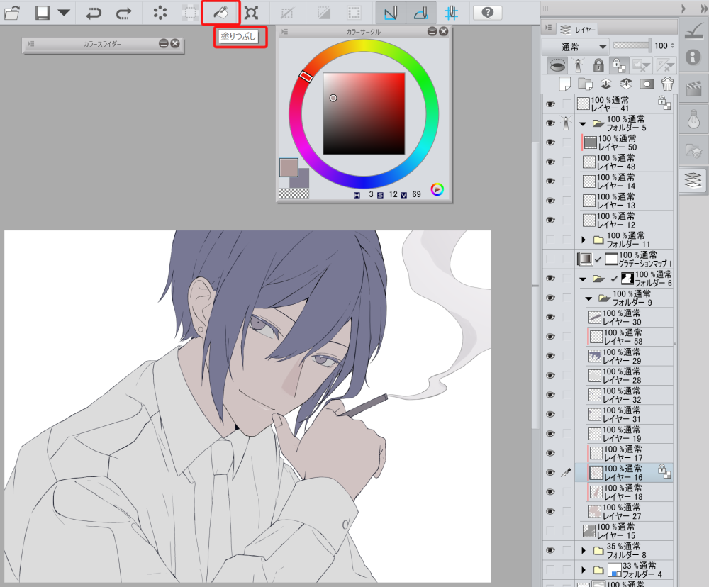
1. Change the multiply layer to a normal layer
2. Check “lock transparent pixels”
3. Use the color picker to select the colors (when the layer is set to multiply), and use the fill tool to change the shadow colors.
4. Turn the opacity back to 100%

I used an oil pastel brush on a multiply layer to draw the large shadows.
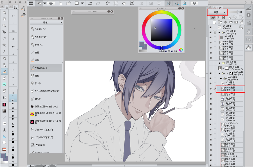
When adjusting values, I turned on the gradation map layer again to check.
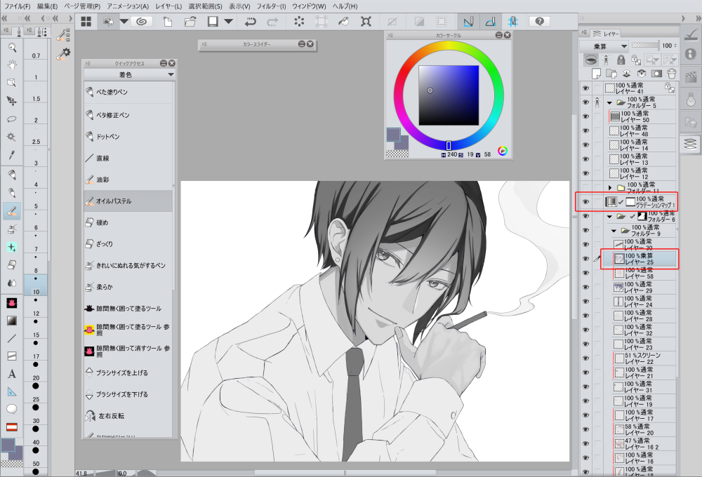
The shadows looked too strong and out of place, so I lowered the opacity.
When I am satisfied with the values, I turn the gradation map off.
The shadow of the hair is big, and the hair still looks flat, so I added a lighter shadow.
I made sure the 2nd shadow is lighter than the 1st shadow, by turning on the gradation map layer while painting.
I added highlights to the skin, hair, and clothing.
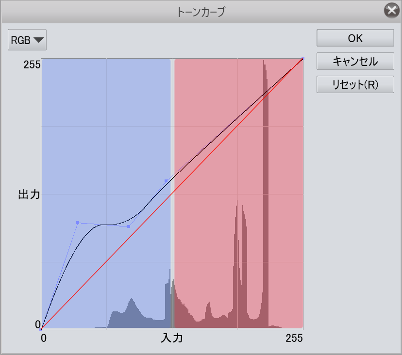
I finally adjust the whole image using tone curves.
The red line is the default settings, without any adjustments.
By moving the curve above that line, the image becomes a lighter color.
The left side of the curve is for the dark colors, and the right side is for the lighter colors.
If the darker colors seem too dark, you can fix it by creating a curve on the left side.
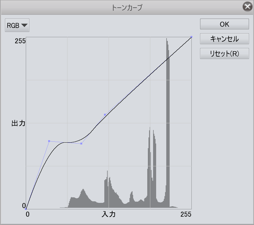
Color scheme 1
Here is the version with the 2nd color scheme.
Color scheme 2
By using the gradation map, you can easily check the values to see if it’s well-balanced while painting.
It helps when drawing a handsome male character!
Please try using that method to create a low saturation artwork!
Writer/Artist: Hachino Mido


