How to calibrate to make a pretty color
2021-04-09

Let's correct the color of the picture in a prettier way!
1. Let's get the picture to be corrected.
The main color I am going to correct is black + red. I will make a variety of black that I think is difficult to correct.
Note: The outfit is not my design, it's the design of the outfit on Twitter @LeMenNotte
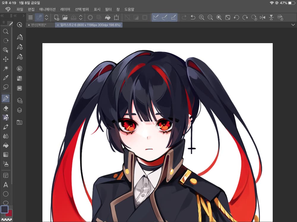
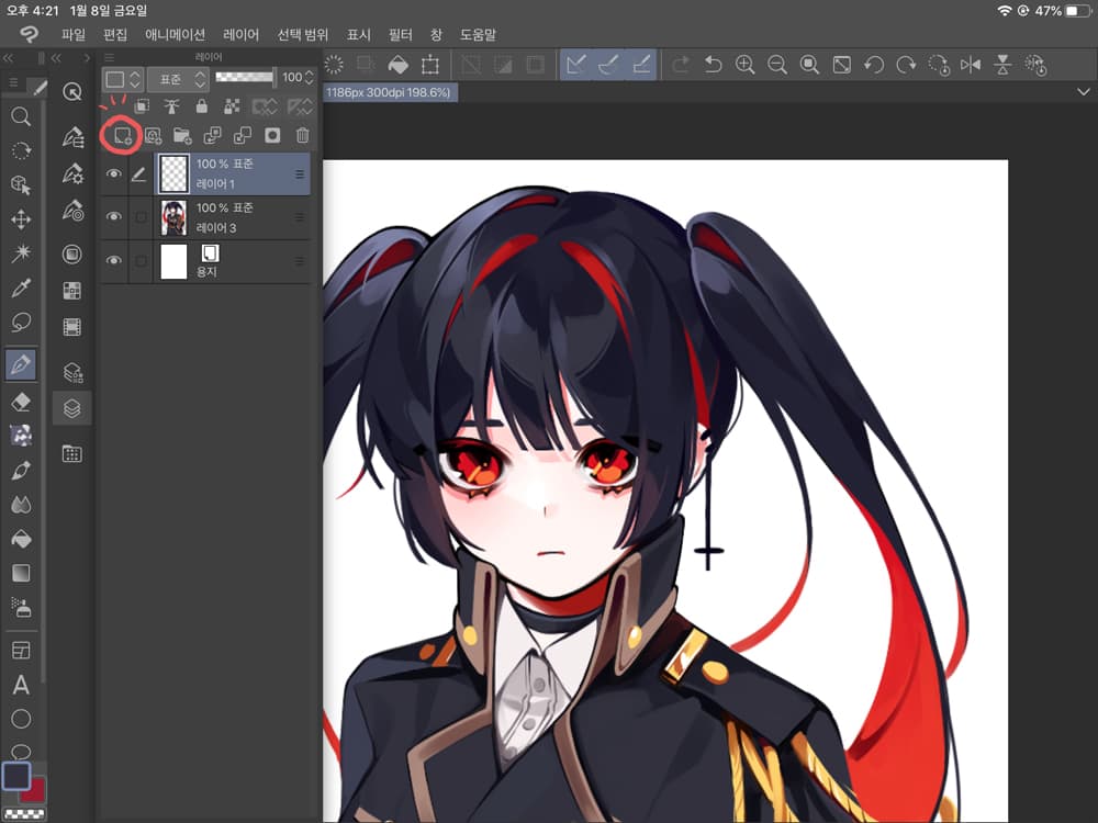
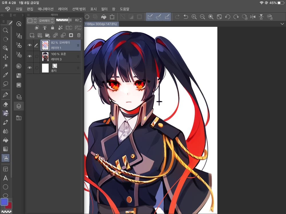
2. Adds a new layer.
Please go into the layer window and follow the pink circle.
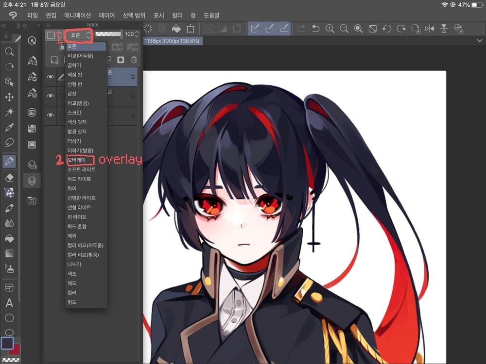
3. Press Standard to select the overlay.
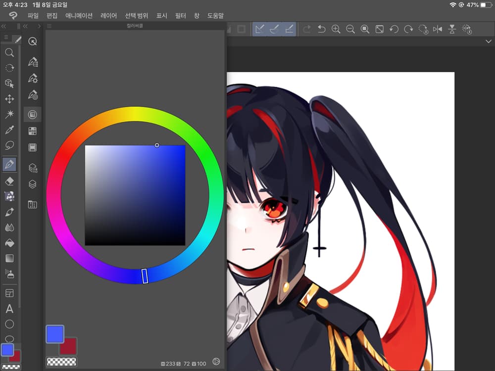
4. Select a blue color for your black hair.
I chose blue to blend with the side color red.
When I use blue overlay for black hair, it adds a mysterious atmosphere, so I usually use it.
5. Use an air brush to color the highlight areas.
The highlight is brighter than the side color, so you can focus on highlighting the effects of the overlay.
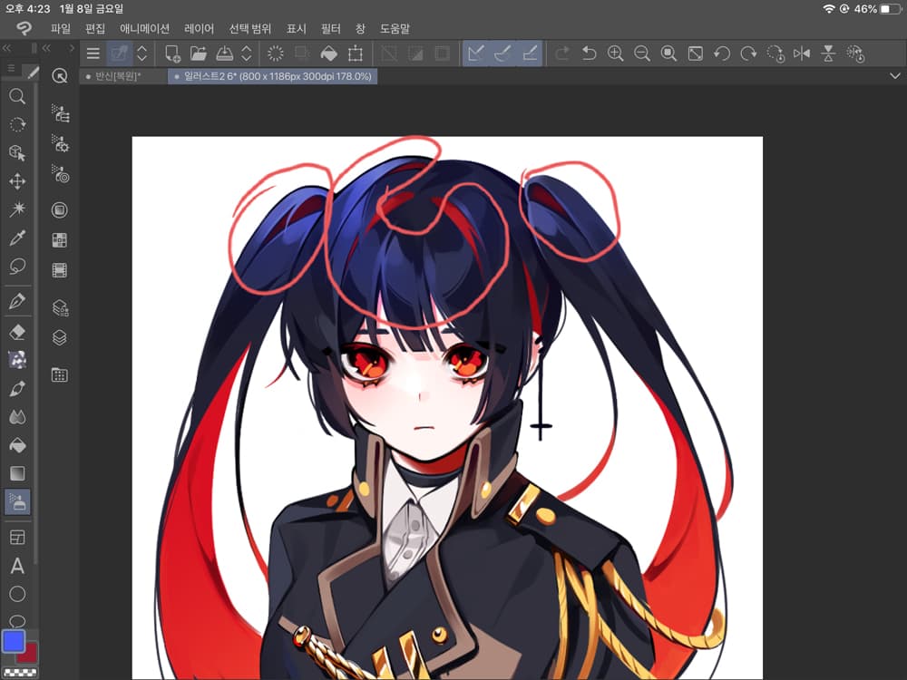
6. Select pink color to organize skin tone and surrounding color. Also, rub the face with an air brush.
I usually use the coral between pink and orange.
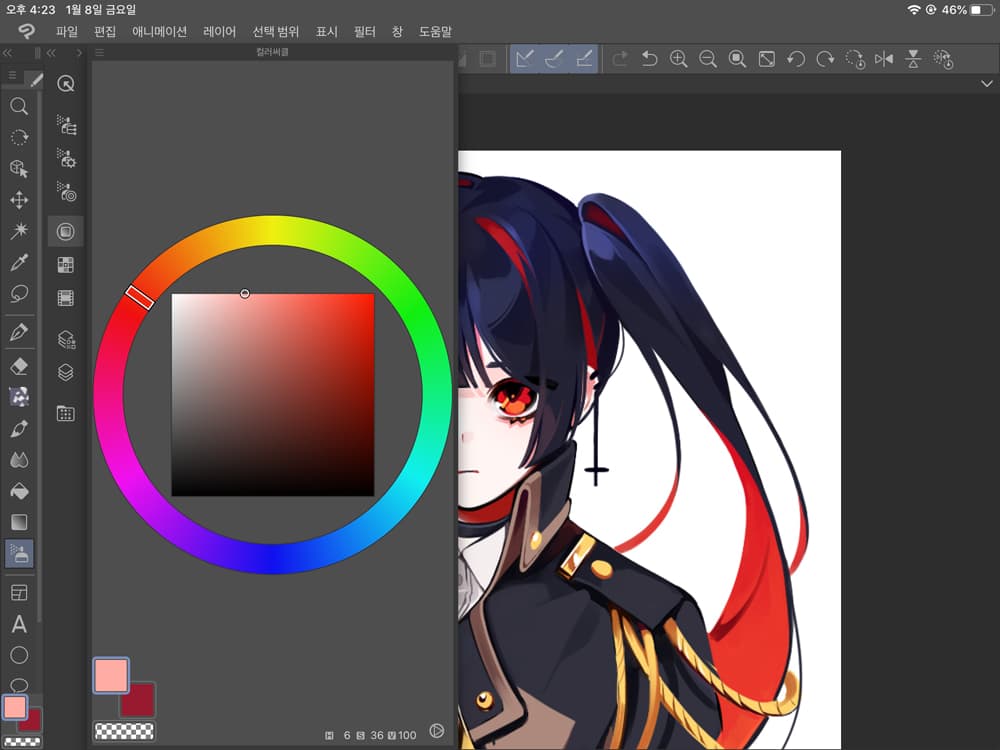
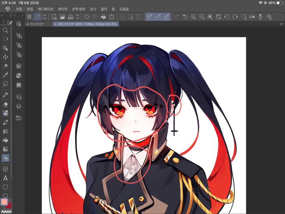
7. Set the red color for the glow of the eyes and airbrush the iris.
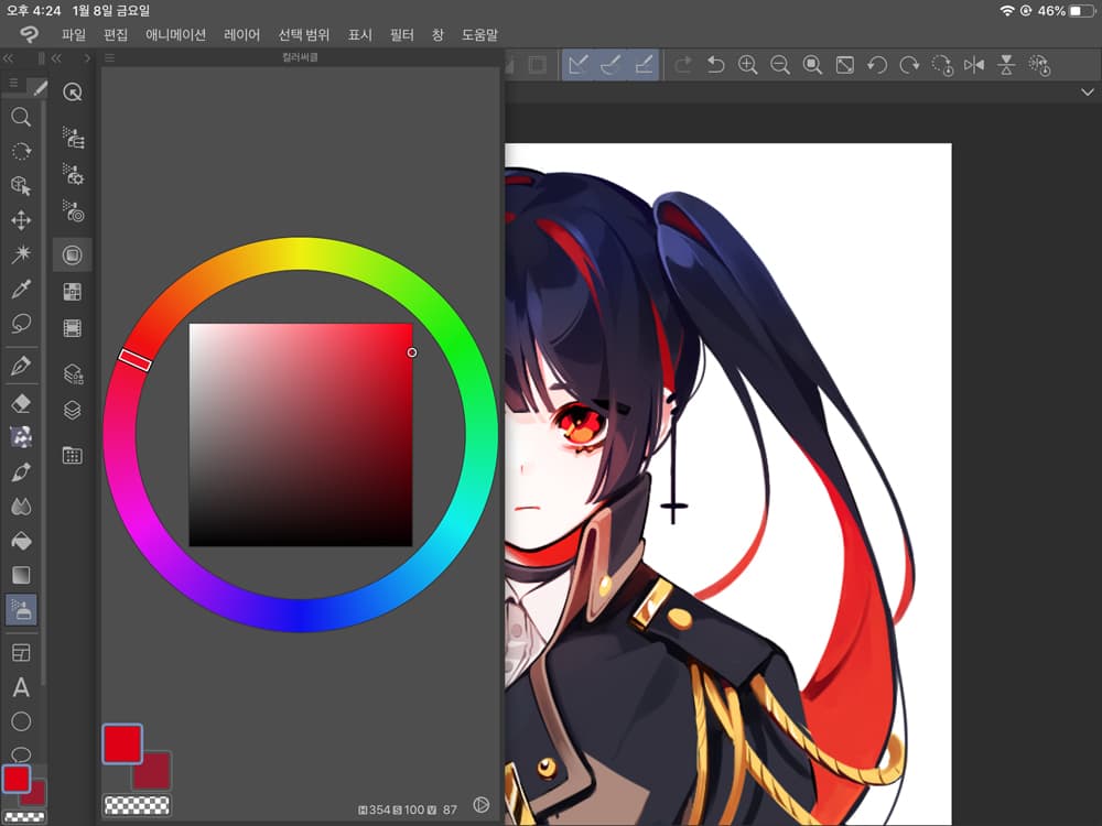

8. For a transparent feeling, select a color to paint under the iris and apply only on the bottom.
Red is pretty to turn from orange to yellow and turn bright.
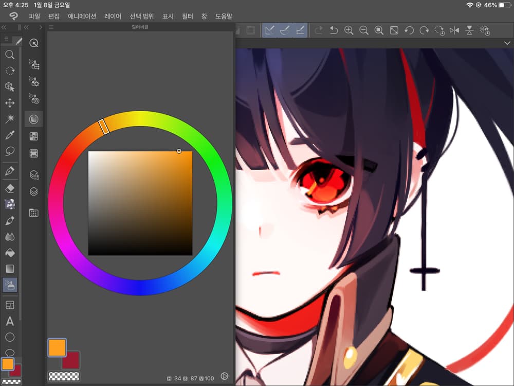
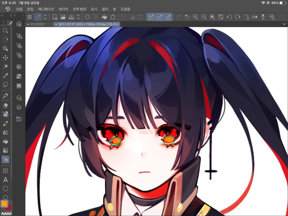
9. Let's paint it with an airbrush to emphasize the red color of the hair.
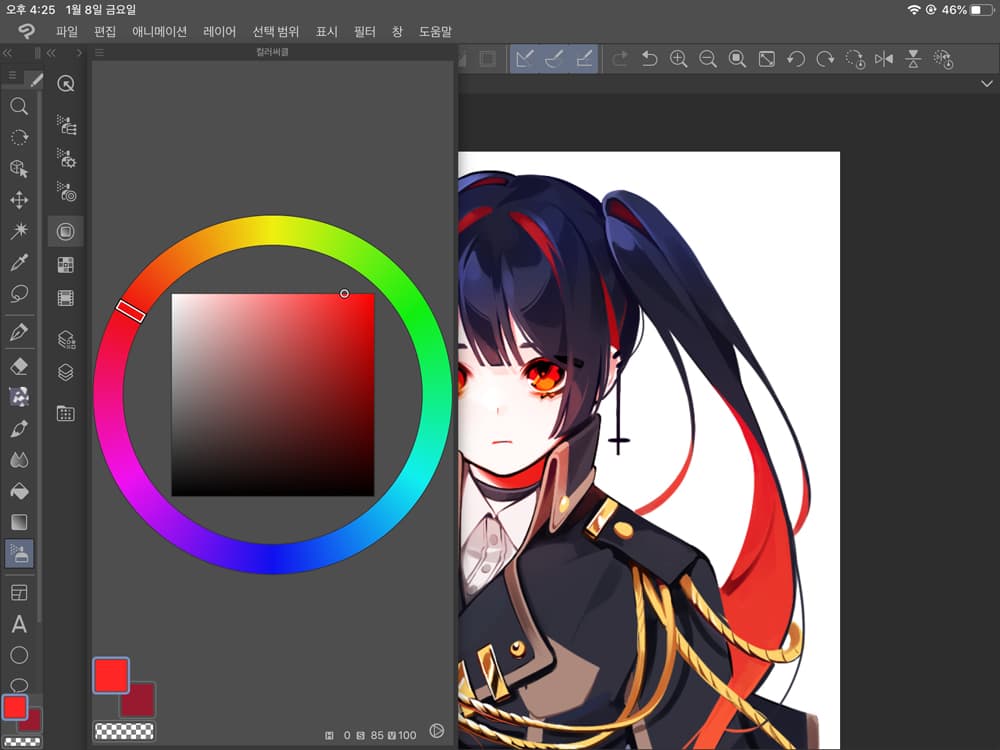
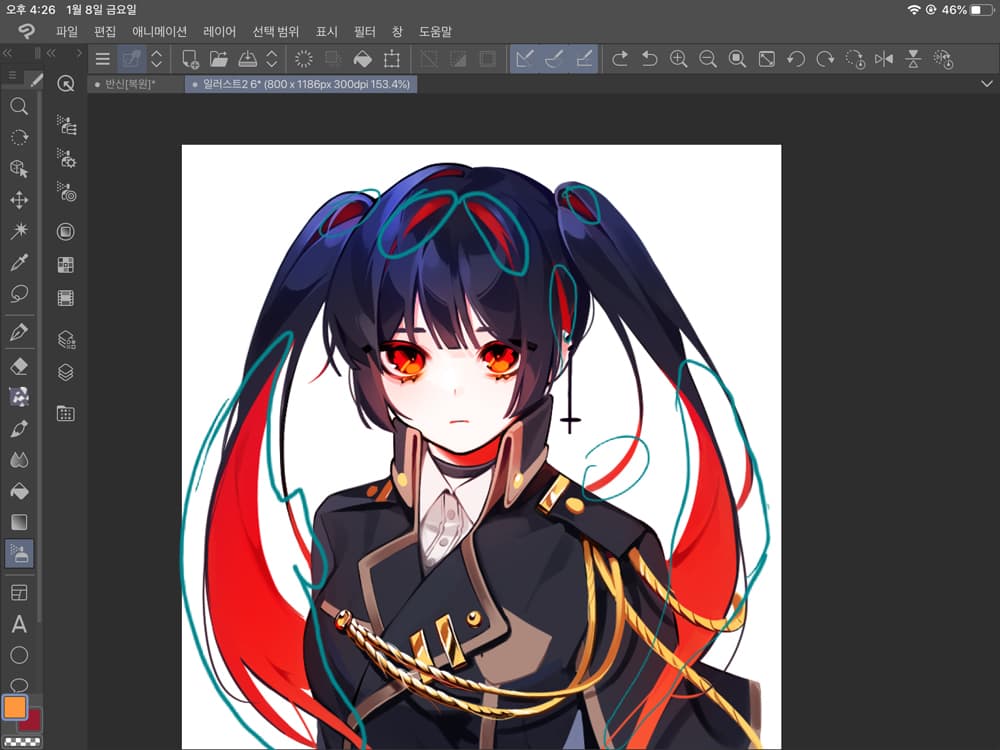
10. Let's make the gold cord of the clothes yellow.
After that, apply a big blue color once.
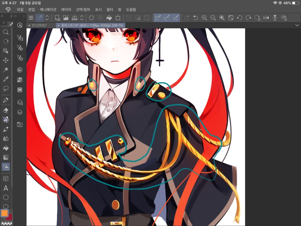
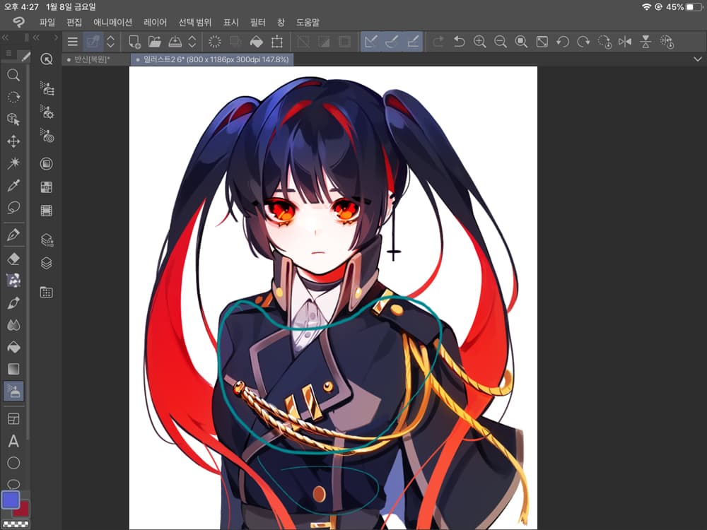
11. Lastly, adjust the transparency of the overlay to suit your taste.
I like bright colors, so I tend to adjust it to 90 to 75 percent.
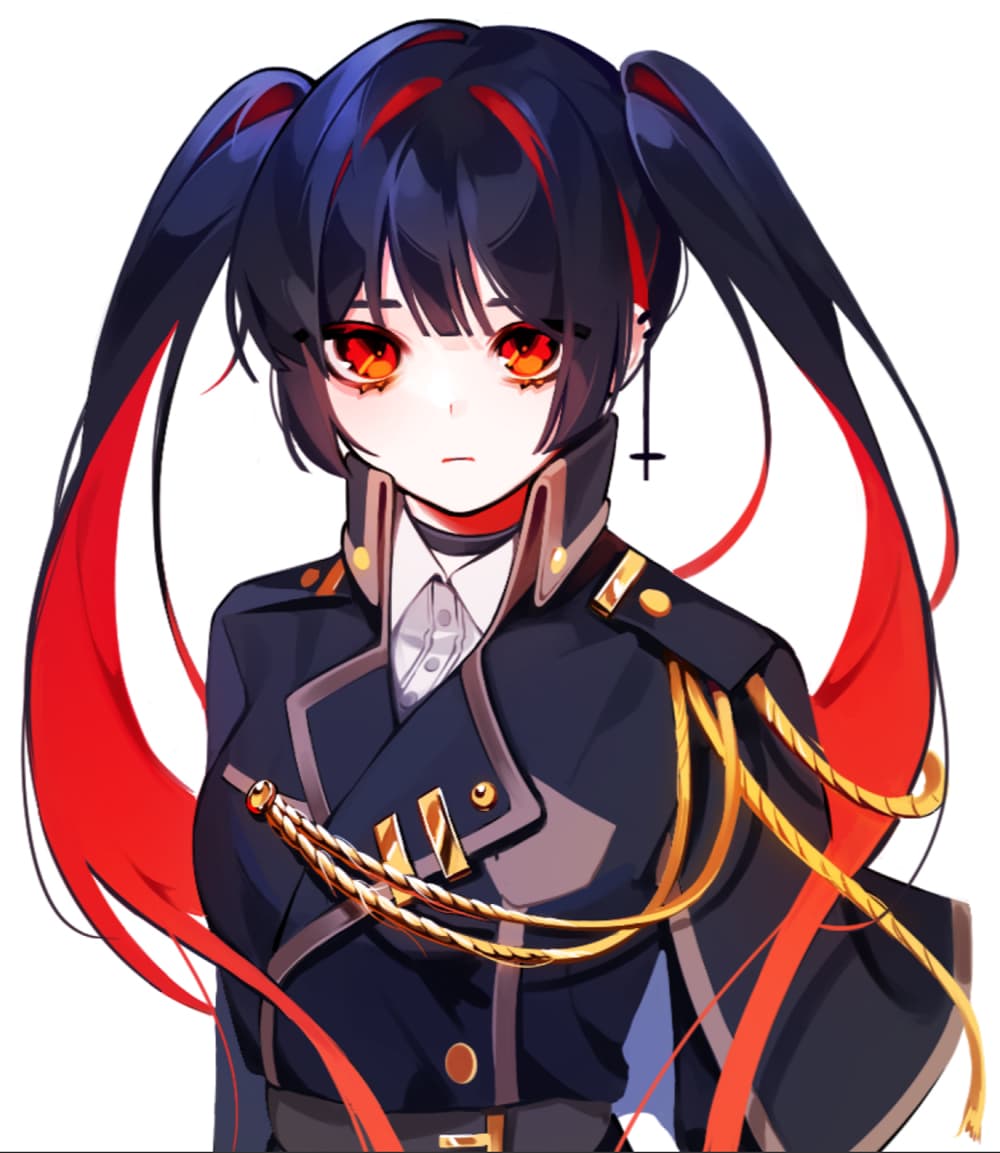
Let's check out Before After!
Calibration is pretty, but it's also important not to overdo it, so the last stage of transparency control is really essential.
Thank you for watching.
Before

After
Click here for the collection: https://medibang.com/u/KBOKO/
twitter: https://twitter.com/BOKU_1222?s=20


