Watercolor Style Illustration Techniques
2021-06-25

In this article, I'm going to explain how to draw in an analog watercolor style using CLIP STUDIO PAINT.
Basically, we need to use our favorite analog style brush on the multiply layer.
Simple advice is repeating these steps:
(1)Color
(2)Blur and Stretch
The trick is not to blur too much and to leave a strong edge on the border of the highlight.
The painting process is the same no matter which brush you use, so feel free to discover or create an analog-style brush that you like and try it out.
If you use your own brushes and textures, you will be able to create your own unique style, but in this course, I mainly use presets and free tools so that anyone can try.
(Line drawing is adjusted according to your habits, so there will be some differences.)
<Main Tools>
【Line Drawing】Please use your favorite pencil tools such as real pencil, drawing pencil, or your original brush.
【Coloring】Dear Watercolor Set(鹿水彩セット内 鹿下地・鹿水彩)
【Stretching】Warm Analog Material(あったかアナログ画材内 △Watercolor6/質感水彩馴染ませ)
【Watercolor Style Texture】
・Watercolor Marker & Texture Set(水彩マーカー●▲■とテクスチャーセット内 レイヤーセット/水彩テクスチャー)
・Recycled Paper Printing Style Processing Action Set(再生紙印刷風加工アクションセット内 紙質:再生紙風)
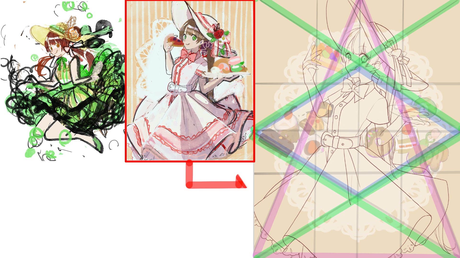
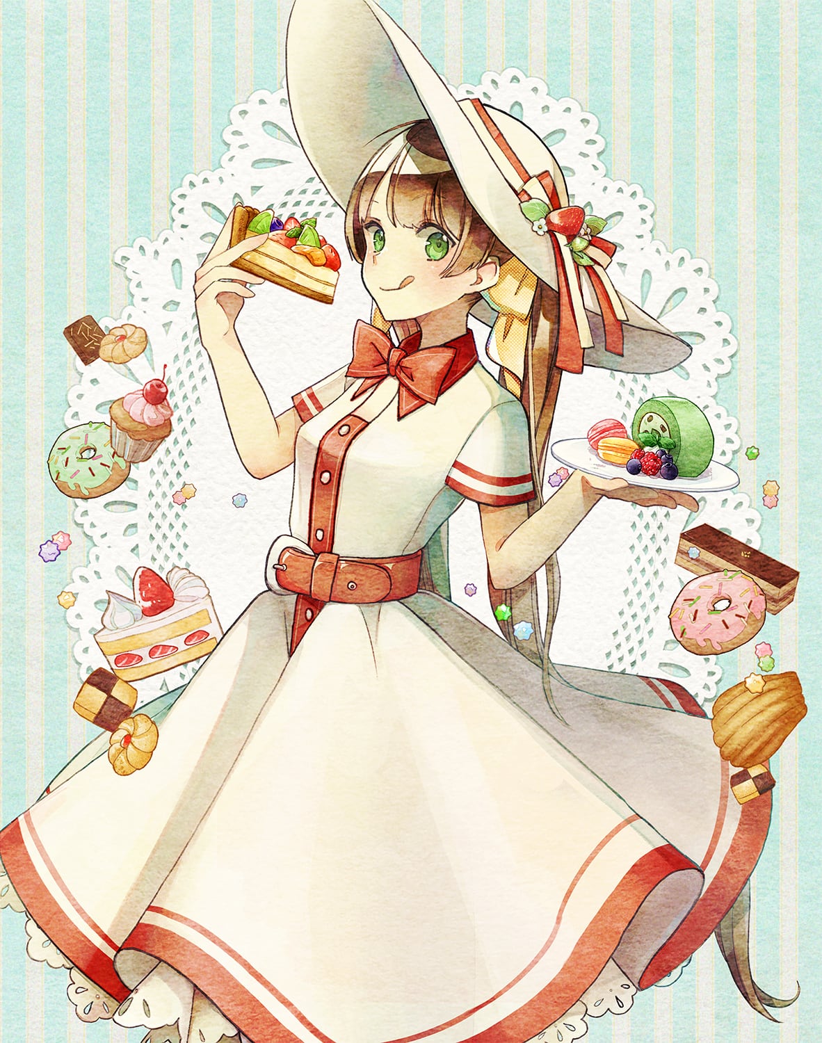
When I drew this illustration, it was early spring, so I had two ideas at first.
(1) Personification of food
(2) Composition of eating the food in a delicious way
I came up with two ideas. This time, I decided to go with (2) because it was easier to solidify the image.
When you make a rough sketch, it is better to think about the shadows.
For the composition, I decided to use a stable triangle with a horizontal bottom (pink line) as the main composition, and place the sub-motifs in the center (blue square).
If you want to draw illustrations but are not good at deciding on composition, I recommend you to learn about composition principles, which will give you many hints.
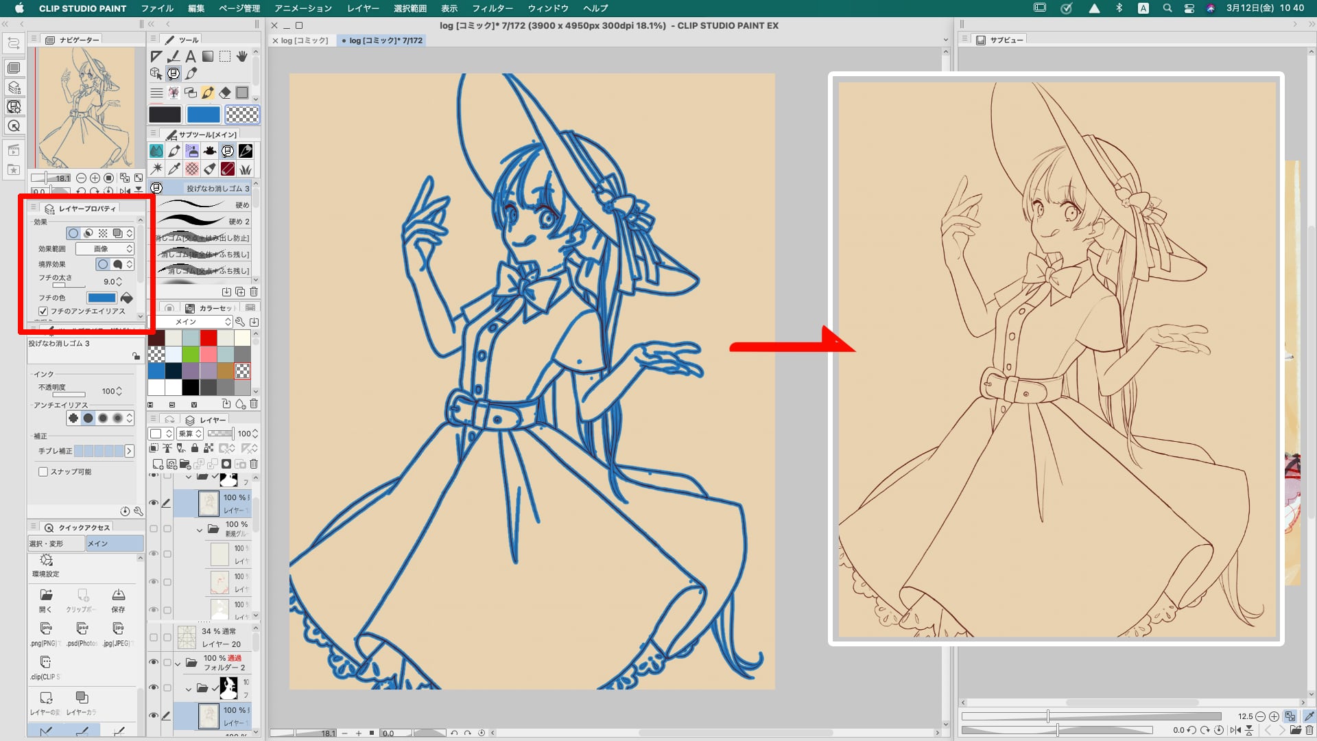
The first step is to create a multiplication raster layer and draw the main character using a pencil-like tool.
There is also a way to create separate layers for each part of the character, but in this case, I chose to draw the entire character on a single layer for an analog look.
When you are done drawing, find the mistakes such as overflow in the line drawing and apply the eraser. It is easier to find them if you add a boundary effect in the layer properties.
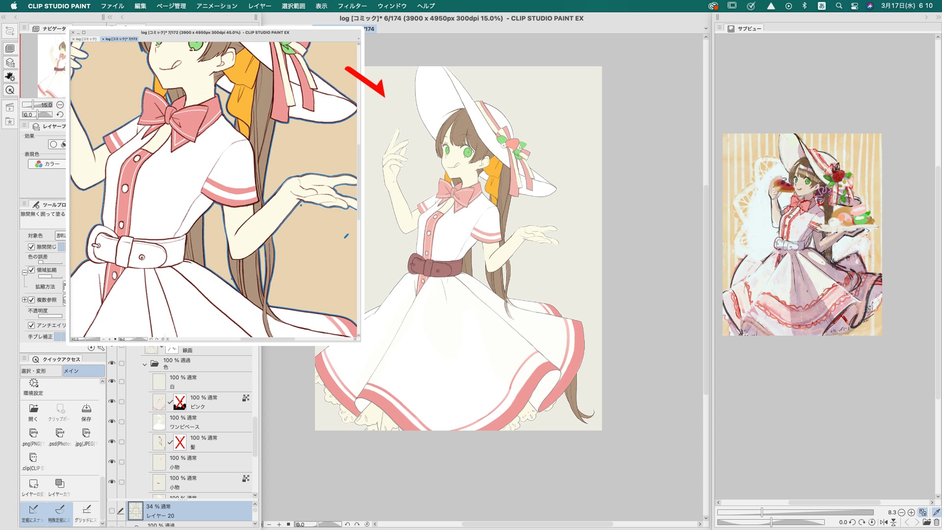
Create a color layer underneath the line drawing layer.
Create a base layer with the entire character filled with the lightest skin color, and then create separate layers for each color.
For the color layer, as with the line drawing, it is recommended to use the boundary effect to remove mistakes for a nicer finish.
Clipping a multiplication layer on top of the base layer.
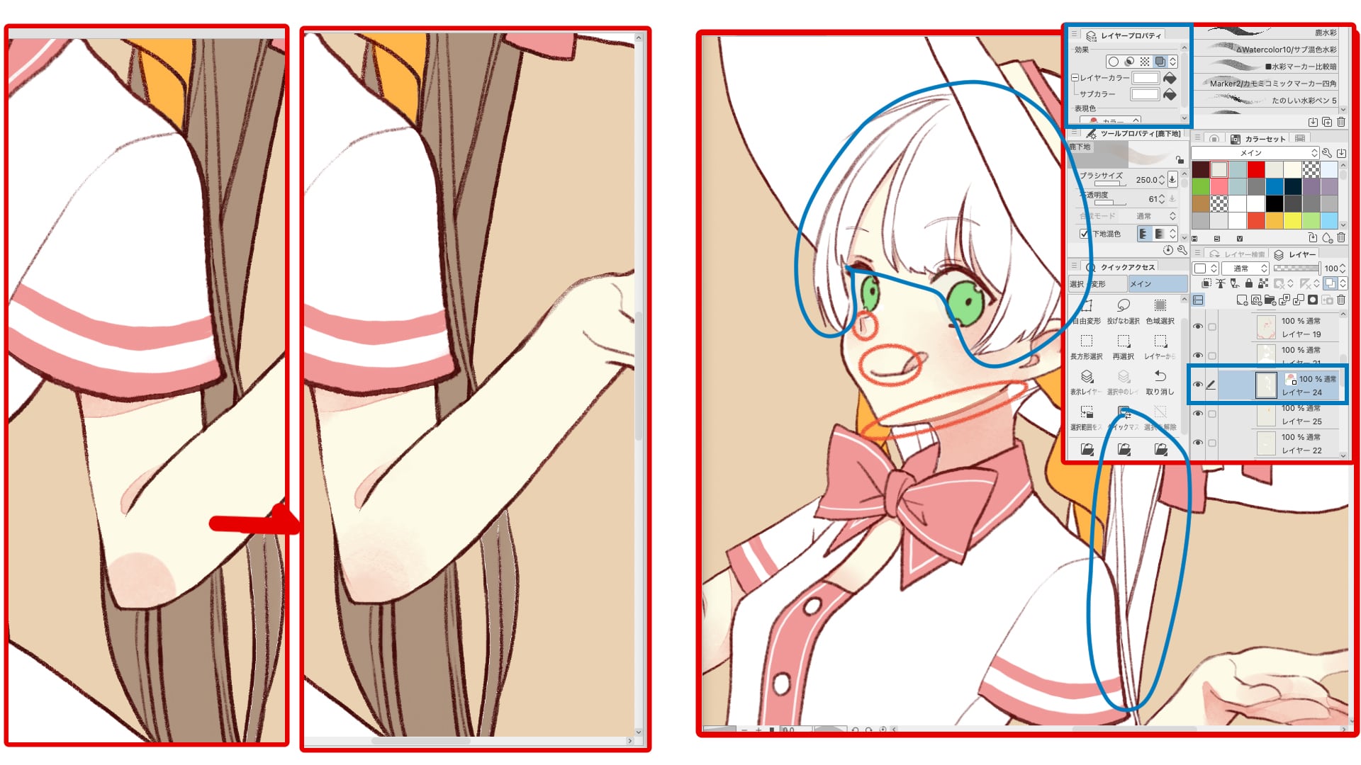
Apply color to the reddish areas of the skin with the [Color Brush] (Deer Watercolor 鹿水彩) and blur with the [Stretch Brush] (△Watercolor6/Texture Watercolor Blend 質感水彩馴染ませ).
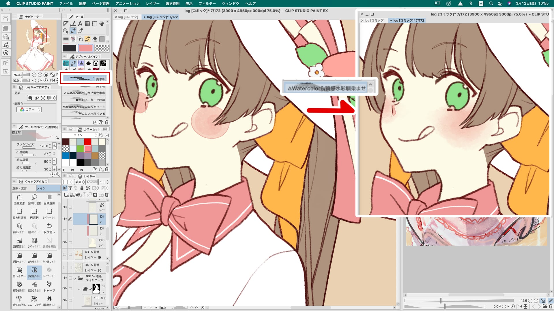
Blur areas that only need to be reddened, such as cheeks and elbows, so that no edges are left.
Add a multiplication layer and add a line drawing or watercolor border to the border area so that the edges remain.
The color can be adjusted later, so let's start painting the hair. Once the part layer is filled in brown, change it to white in the layer properties. This will be the base layer for the hair.
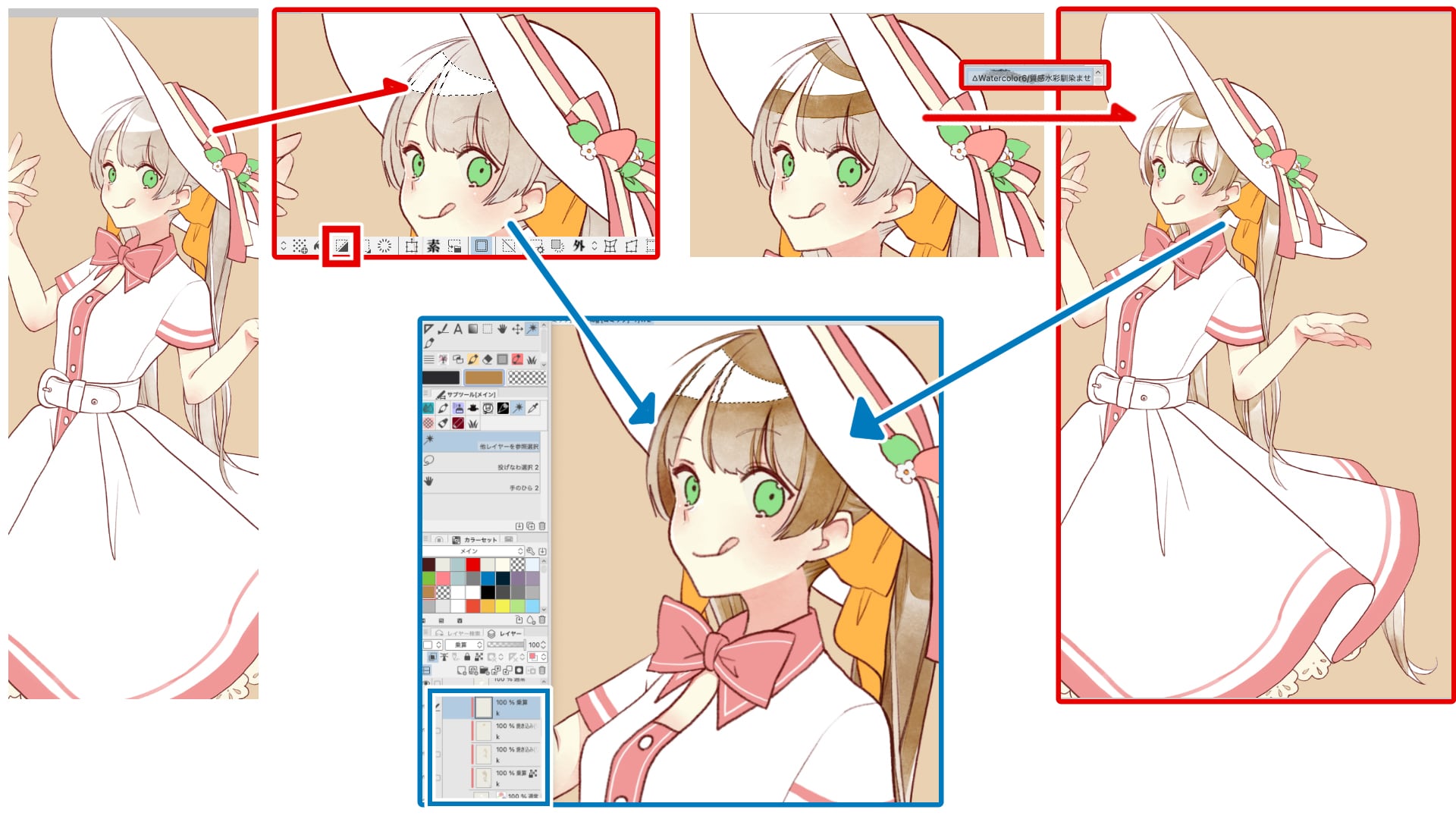
As with skin painting, create a multiplication layer on top of the hair base layer, and use the [Color Brush] to spread the color over the area.
The hair shine and highlights are basically left unpainted. (For details, add highlights afterwards.)
Create another multiplication layer to create an edge around the highlights.
Select the highlight area in the selection, then invert and paint to keep the highlight from blurring.
On the other side of the highlight, use the "stretch brush" to blend it with the hair color.
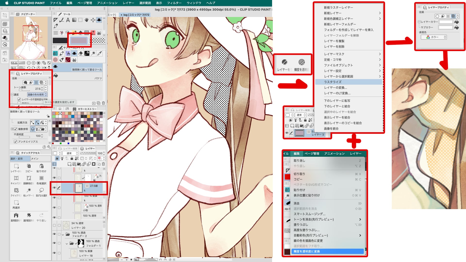
The other parts will be done like the hair. I decided to add dots to the ribbon since it was too tasteless to have a single color.
Create a light colored fill layer on top of the ribbon layer, select tone in the layer properties, select net settings, select circle, and select the number of tone lines with the desired dot size.
You now have a black and white tone layer.
By rasterizing the tone layer, converting luminance to transparency, and converting the layer color to white, a white dot pattern was created.
It is useful to register "Rasterize" and "Convert Luminance to Transparency" as Quick Access functions.
By repeating the above process, the entire character is now painted.
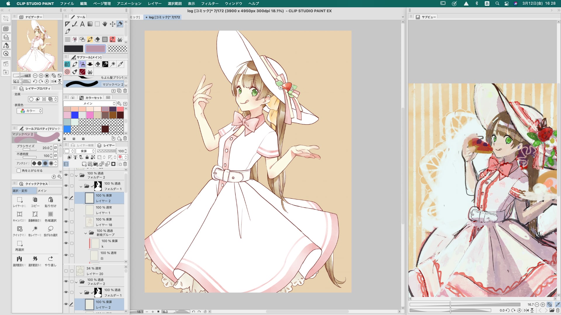
Create a multiplication layer on top of the line drawing and color layer, and add shadows with one color. Clipping the normal layer, paint lightly lit areas with a yellowish color, deeper areas with a blueish color, and blur with white.
Parts above in the same way as for the painting, clipping the multiplier layer to add more paint to the areas that need it.
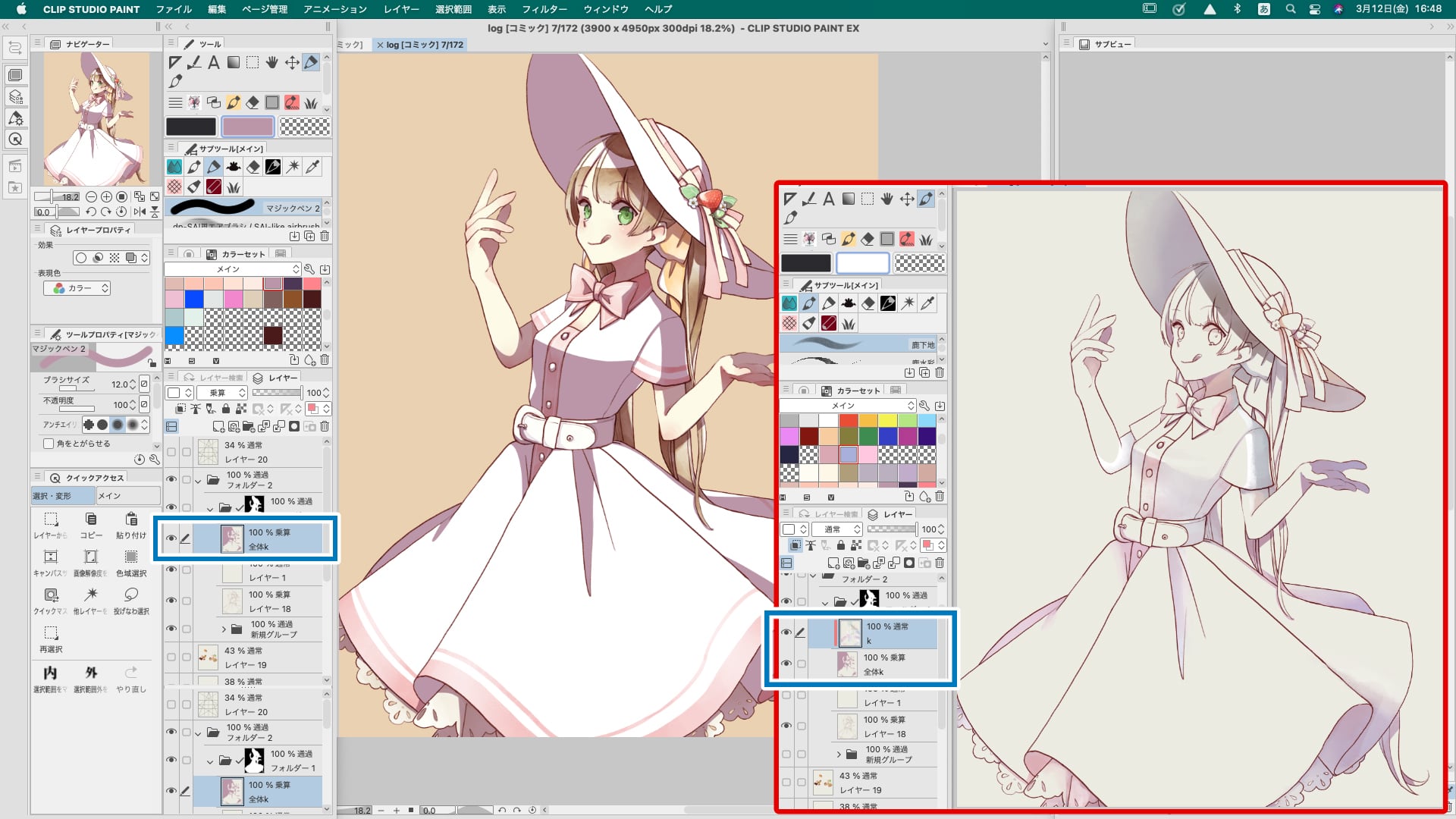
This is what it looked like when I overlaid it on the character.
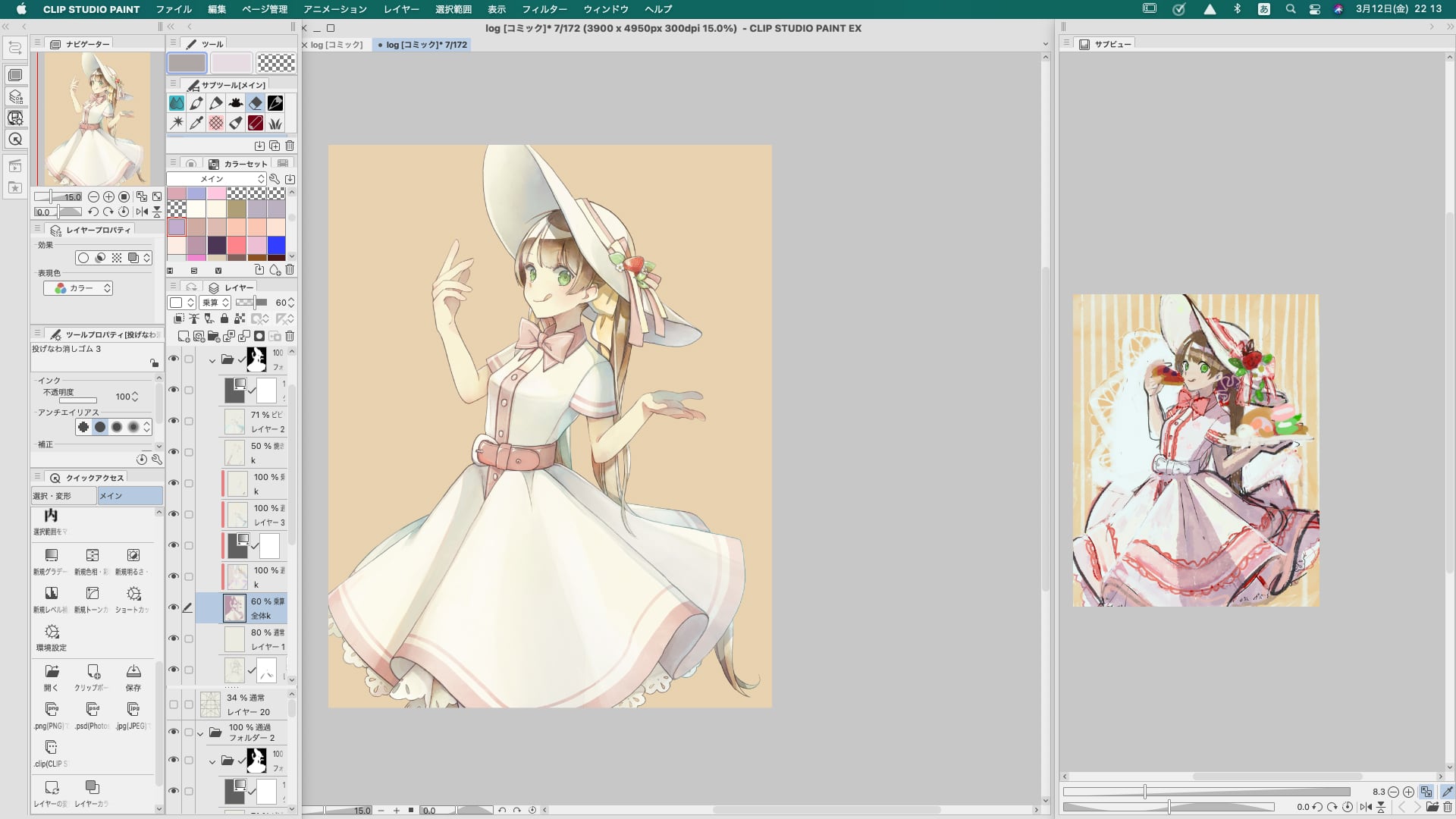
Create a stripe for the background. As with the ribbon dots, create a fill layer with a light color, select Tone in the layer properties, select Net Settings, select Line, set the angle to 90 degrees, and select the desired thickness for the number of tone lines. Now you have a black and white striped layer.
Rasterize the tone layer and change the shade to your liking. The rough orange color is fine, but since the accent of the dress and the color of the hair are the same color, I changed the color to a fresh green.
Create a lace layer for the background.
This is the image of the bottom of the cake. First, to find the center of the screen, go to View→Show Grid→Set Grid Ruler→Set Origin to Center.
If the grid is too fine, set a wider spacing in the grid settings.
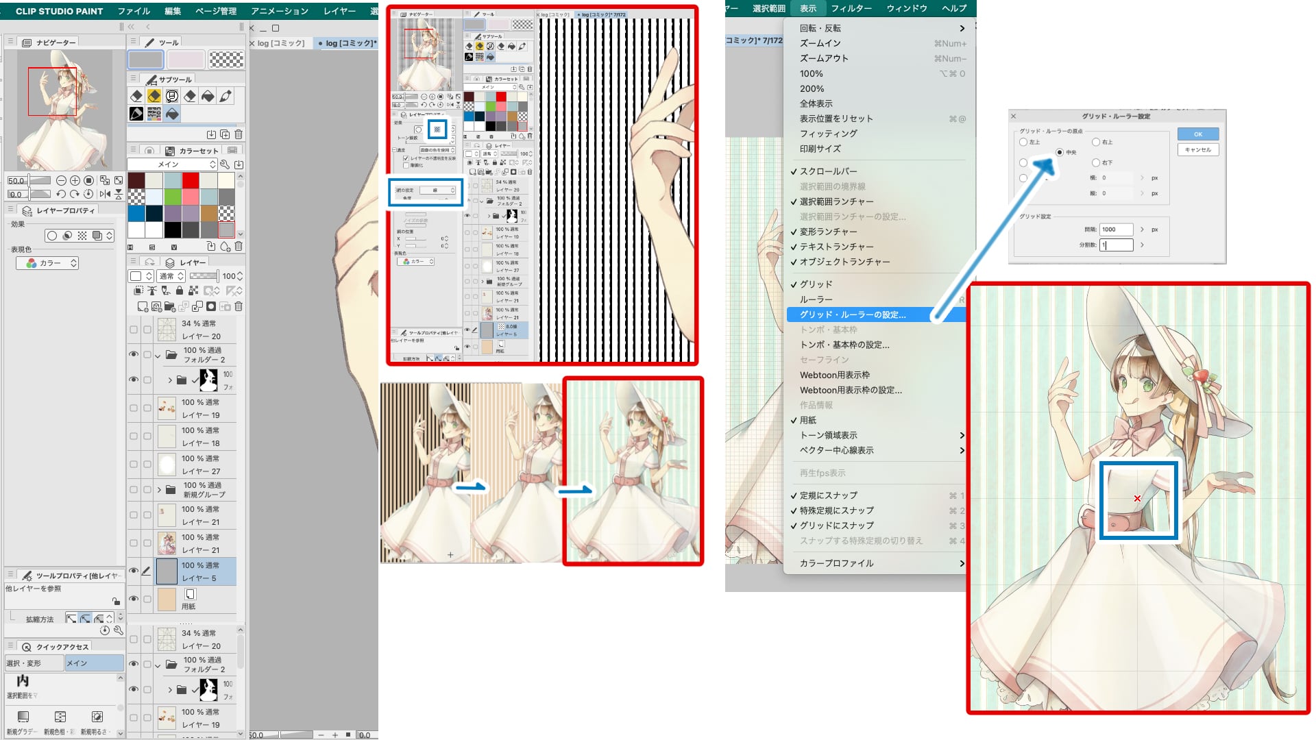
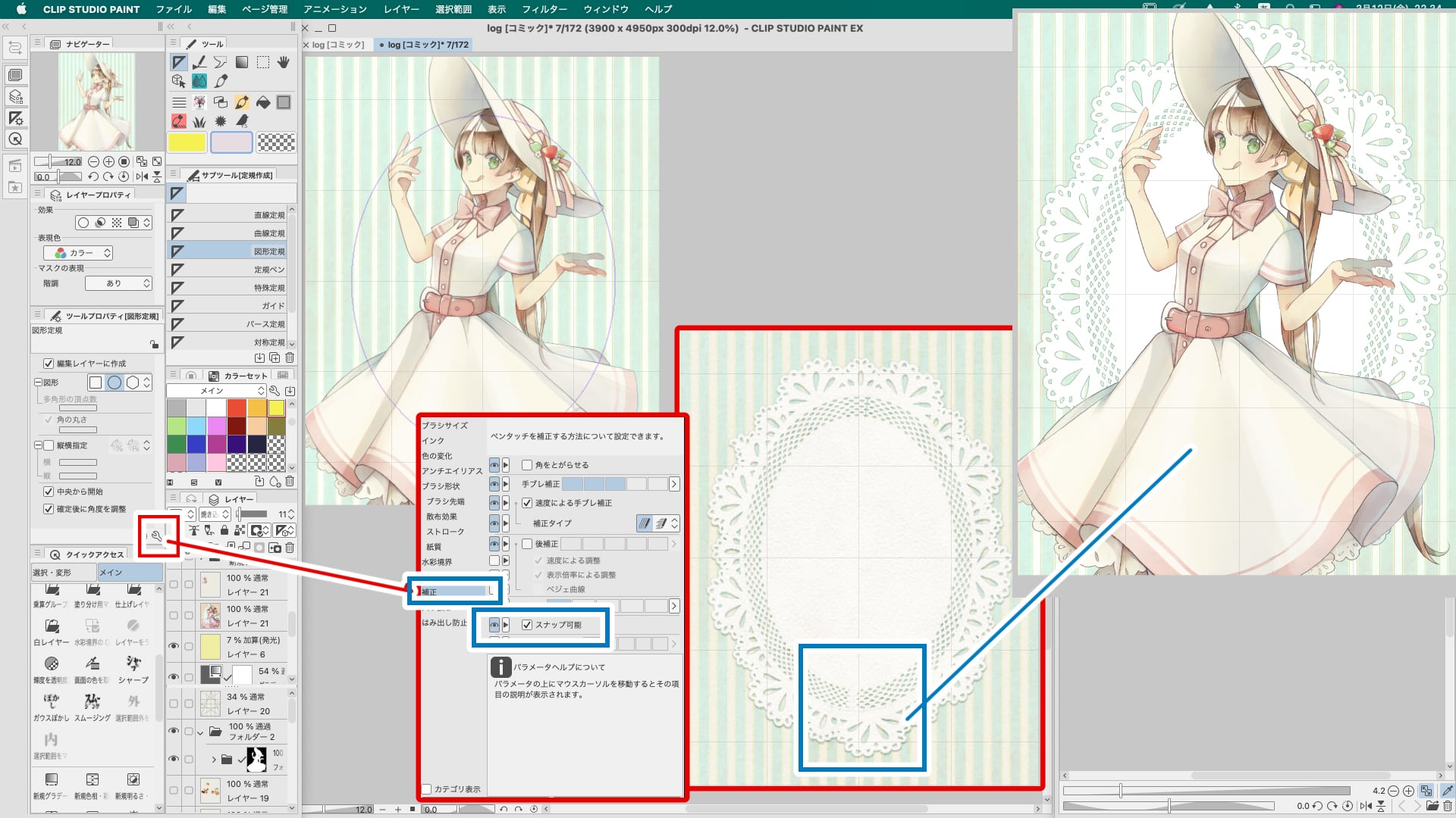
Select a circle on the ruler, check the box for starting from the center, and draw. I used a lace brush of my choice along the ruler line and filled the center with white.
To draw a line along the ruler, make sure to check the Sub-tool Details→Correction→Snappable checkbox in the Brush tool.
If you don't adjust it very well, the beginning of the lace will not connect nicely. Place the lace where it will be hidden by the character.
As with the characters, the process is from rough drawing to line drawing to coloring.
It's a little more work, but it's easier if you draw the parts that are hidden by other things so that you can change the placement.
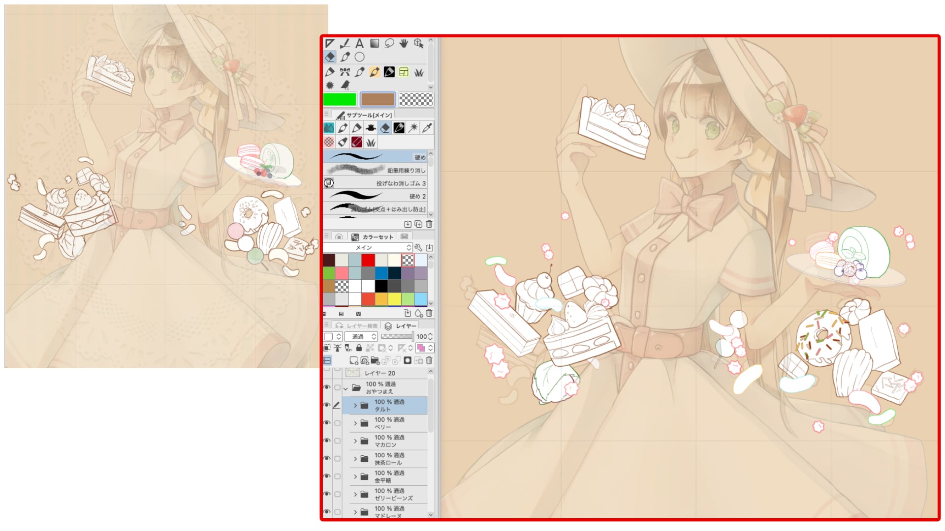
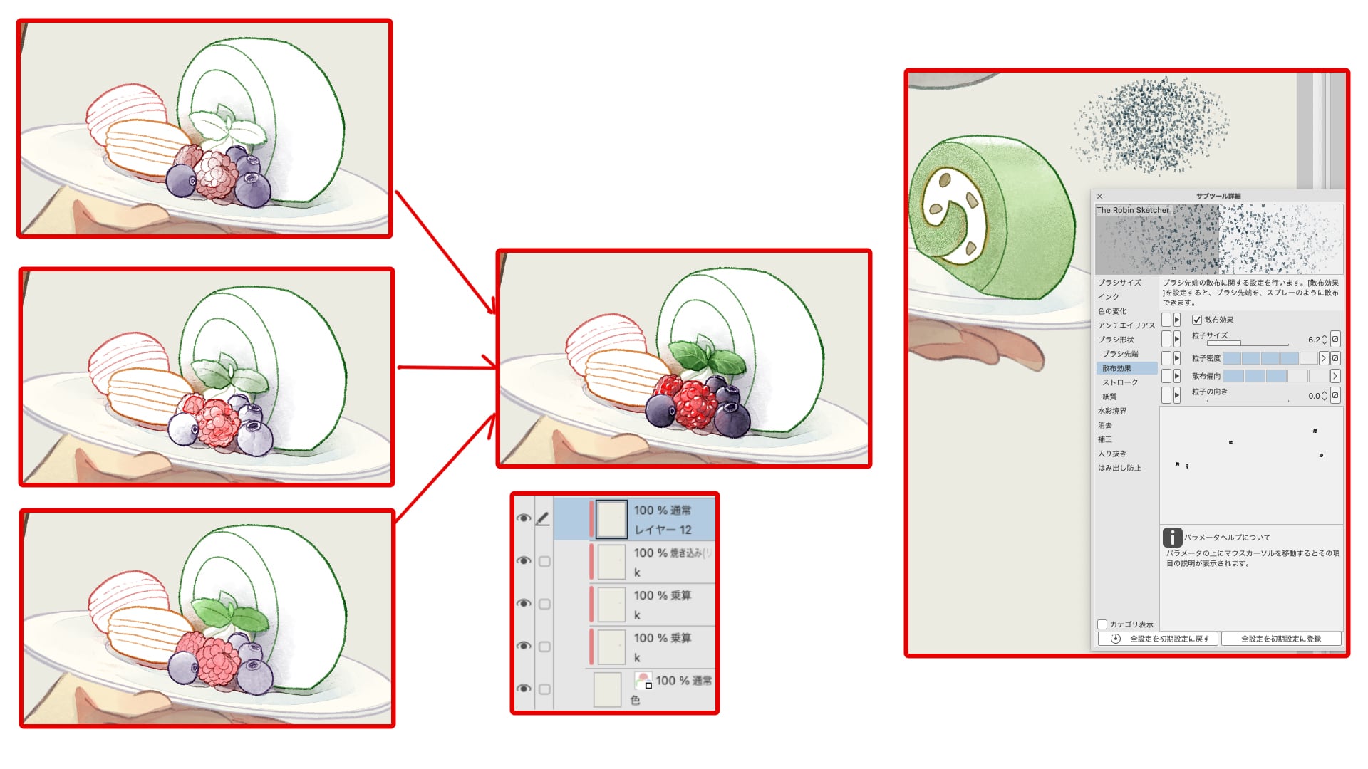
White base layer -> multiplication layer for coloring + shadows + highlights.
We recommend using the Pencil tool to represent things that are rough or not shiny like a roll cake. Try painting like a normal colored pencil, or use the Sub-tool Details → Scattering Effects → Adjust Particle Size and Density.
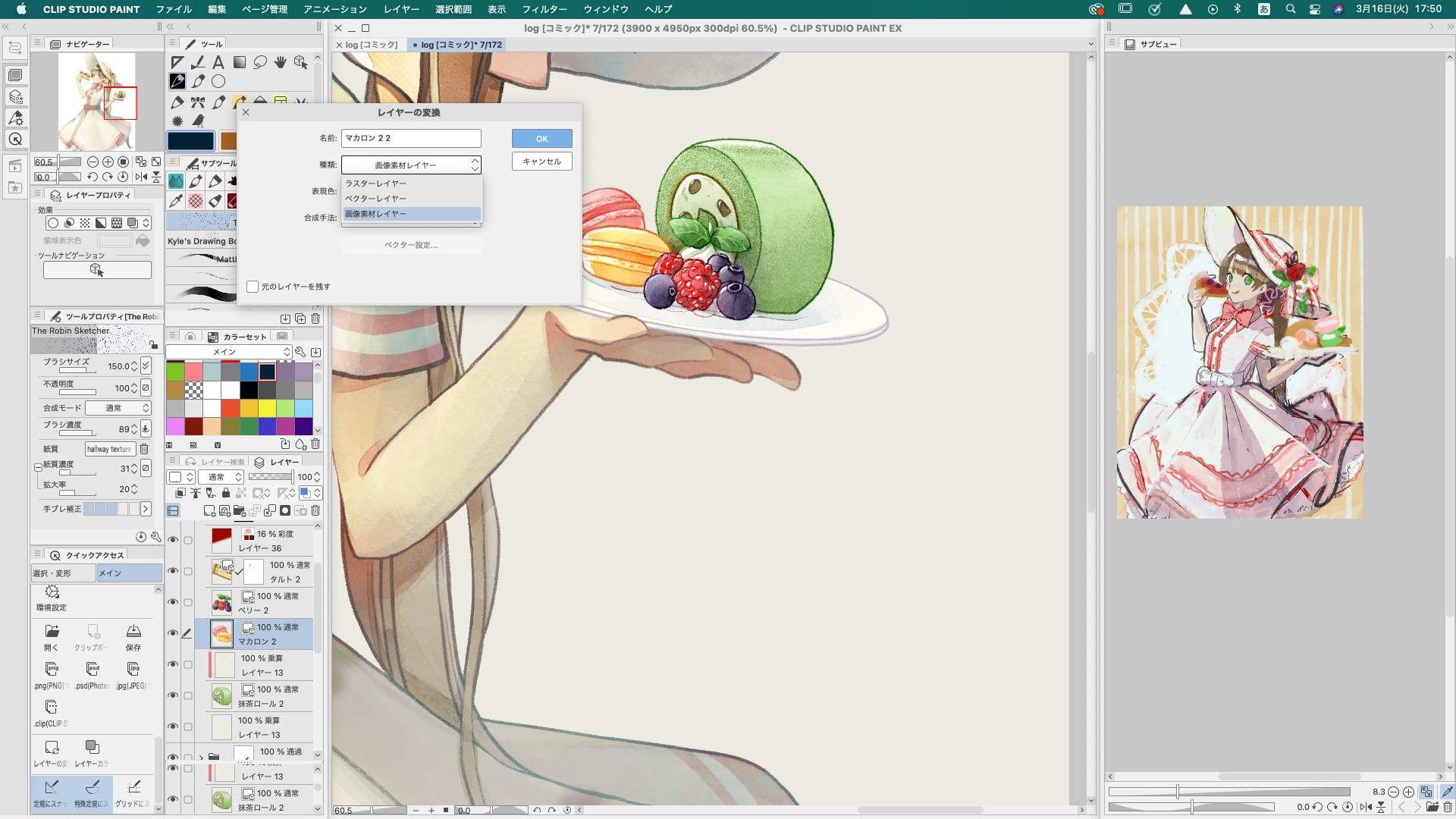
Once the food is drawn, convert the layer to a material layer, taking into account any changes in placement as mentioned earlier. Now you can't draw directly on this layer, but you can transform it without losing quality.
Here is the actual arrangement as shown in the rough.
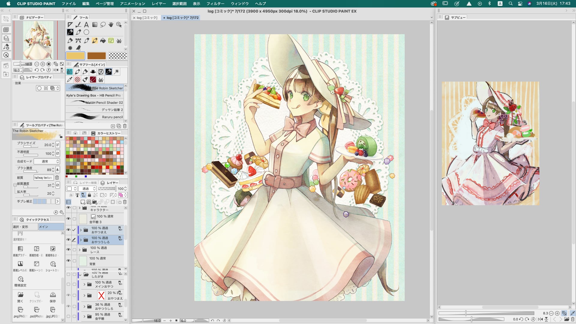
The rough image looks a bit messy, so I rearranged it, displayed the whole image, color corrected it, and finally added a watercolor texture.
Thank you for reading to the end!
Click here for the collection: https://medibang.com/u/amrta/
twitter: https://twitter.com/suiccl
http://rabbit.tank.jp/


